- Synchronous- when the sound is synchronised with the object emitting the sound.
- Asynchronous- when the sound is deliberately played out of sync (out of time).
- Sound Effects- a sound other than speech or music made artificially for use in a play, film, or other broadcast production.
- Sound Motif- A sound effect or combination of sound effects that are associated with a particular character, setting, situation or idea through the film.
- Sound Bridge- one of the most common transitions in the continuity editing style, one that stresses the connection between both scenes since their mood (suggested by the music) is still the same.
- Dialogue- the transmitter of story information, is usually recorded and reproduced for maximum clarity.
- Voice Over- a piece of narration in a film or broadcast, not accompanied by an image of the speaker.
- Direct Address/Sound- issues from the source itself, such as those frequencies coming from an actors mouth.
- Sound perspective- refers to the apparent distance of a sound.
- Score- music composed, arranged and played specifically for the production.
- Incidental Music- non-diegetic music that accompanies events or changes of scenes.
- Theme- music that always accompanies a particular programme or a particular character and suits its moods or themes.
- Stings- these are short bursts of music.
- Ambient Sound- can be recorded on location or can be added to the sound track.
Thursday, 23 October 2014
ALZ Work - Sound Terms
What is the definition of these sound terms?
Wednesday, 22 October 2014
Monday, 20 October 2014
Research & Planning - Double Page Spread Draft

This is my double page spread. I like the layout that I have chosen with the title going across the bottom and like a border of different images across top of the page. I have decided to have the main image in the middle of the double page spread. I have set out my writing as columns so it is clean and simple for my reader and also so it will be easy to read for my reader. I will have the subtitle or a quote above my first column. I think I will have soft colours on the double page spread but this also depends on what type of story I will chose to write about.
Research & Planning - Contents Page Draft

I have decided to have my font going portrait down the edge of my page. I have done this because I feel it would be a different type of style to do and I want my magazine to be eye catching and successful. On the other hand, I am unsure on if I would keep it like this as I think it could maybe look more magazine style of it was in another position. I have decided to have more than one image on my magazine but I think it could maybe be too much depending on what style it is on image. I have lines splitting up each story/information which I like as I feel it would be more simple and less confusing for my reader.
Research & Planning - Front Cover Draft

This is my magazine draft of my front cover. I have chosen Indy Pop as my masthead because 10 out of 10 people from my questionnaires said it is a suitable name for my genre and 2 out of 3 people said it was suitable from the audience responses. I have chosen £2.00 as my price for my magazine because I feel that is the most suitable price and this was one of the popular prices in my results. I have chosen to draw both male and female on my front cover because I am indecisive on whether I should have a female or male and female. I have quite a few cover lines on my magazine draft as I feel this is a suitable amount to draw in my audience. I have added special addition and it is a unique selling point because it is a special addition it make intrigue more people to buying it. As it is a music magazine I think it is a good idea to add music awards, I found this idea when I was analysing another front page of a magazine.
Research & Planning - Production Schedule

This is my production schedule. I have used this to help me keep on track of my work and help me with what I need to do each week.
Research & Planning - Equipment and Software List
These items below are necessary in the production of my music magazine.
1. Apple Mac

2. Tripod

3. Camera

4. Photoshop

5. Indesign

1. Apple Mac
2. Tripod
3. Camera
4. Photoshop
5. Indesign
Sunday, 19 October 2014
Research & Planning - Questionnaire Analysed
These are the analysed results of my questionnaires. From analysing my questionnaires I found that for question 1 (Do you think 'IndyPop' is a suitable name for my music magazine?) 10 out of 10 people agreed that 'IndyPop' is a suitable name for my indie pop magazine. For question 2 (Do you think the model on my magazine should be male or female?) 5 out of 10 people thought my model should be female, 4 out of 10 thought my model should be male and 1 out of 10 thought I should have both female and male. For question 3 (What 3 colours do you associate with a indie genre?) 9 out of 10 people said black is a colour they associate with indie. The other 2 most popular colours were red, blue and grey with the same amount 5 out of 10. For question 4 (What 3 colours do you associate with a pop genre?) the most popular answer was pink with 10 out of 10 people suggesting it. The 2 other colours were yellow and blue. For question 5 (What do you think would be a suitable price for a good quality indie pop magazine?) the most popular answer was £2.00. I agree with this prize as I feel it is suitable for my target audience. For question 6 (How old are you?) I found that most popular age of the people answering my questionnaire was aged 16. For question 7 (What features would you like to see in my magazine?) I found that the 4 most occurring results were images, latest music, interviews and gossip. For question 8 (What sort of bands and artists would you like to see in my magazine?) I found that most people thought Artic Monkeys, Ed Sheeran and Rhianna.
Overall, I think the results of my questionnaire will help me when I am creating my magazine as they are giving me ideas on the things I need to help address my audience so I satisfy my audience's needs.
Overall, I think the results of my questionnaire will help me when I am creating my magazine as they are giving me ideas on the things I need to help address my audience so I satisfy my audience's needs.
Research & Planning - Answered Questionnaires
These are 3 of my answered questionnaires
 that I am going to put into my questionnaire
 that I am going to put into my questionnaire
answers powerpoint.


Research & Out of Planning - Music Magazine Audience Responses

Out of my 3 audience responses I found that 2 out of 3 think that IndyPop is a suitable name for my magazine. Each of my 3 audience response said that they think my model should be a female. The colours I got suggested for an indie genre were orange, white and black. The 3 colours I got suggested for a pop genre were pink, white and yellow. For the price of my magazine I was suggested £2.00-£3.00. Each of of my audience responses was age 16. The features I was suggested for my magazine were outlines around my title, interviews and gigs. The type of bands that I was suggested were Oasis and Artic Monkeys.
Over all I think these audience responses will help me when I am drafting and creating my magazine.
Friday, 10 October 2014
Research & Planning - Double Page Spread Analysis

- The background colour is very soft and elegant. I think it is a good simple colour that has been used as it is an easy colour to match up well with other colours.
- The main image on the double page spread is the main image of Solange in a bright red dress. The main image has Solange looking direction at the camera. I think having the artist looking directly at the camera makes the magazine seem more audience friendly. It makes the audience seem understanding of the story that is wrote about the artist and also makes the audience feel ‘on the same level’ as the artist and the story on the artist.
- The colour of the columns of text similar to the background colour but it is darker which makes it look effective. Although there is a larger amount of text it is all columned which makes the text look organised and it also makes the reader be able to read it more easily. Also the columns make the magazine look like it has had a lot of care and time took to make the magazine and also make the magazine is very easy to the eye.
- The quote that is in a different font and black writing is very bold and it stands out to the reading. It jumps to the reader’s attention. When the reader reads this text it will make the audience feel like they need to carry on reading to find out more about the quote.
- The colour scheme of black, red and blue are bright colours and they attract the audience and keep them intrigued. The bright red colour on Solange’s dress keeps draws the audience straight to her and makes her very eye catching.
- This larger text looks like it is like a title or subheading about what the article is about. They have ‘Solange Knowles’ know a different colour font than the rest of the text which shows that ‘Solange Knowles’ is the main focus in this magazine.
- The black and white images of Solange Knowles show Solange’s fun side of her personality. I think it is very creative of the magazine having these images of Solange on the magazine.
Monday, 6 October 2014
Research & Planning - Contents Page Analysis
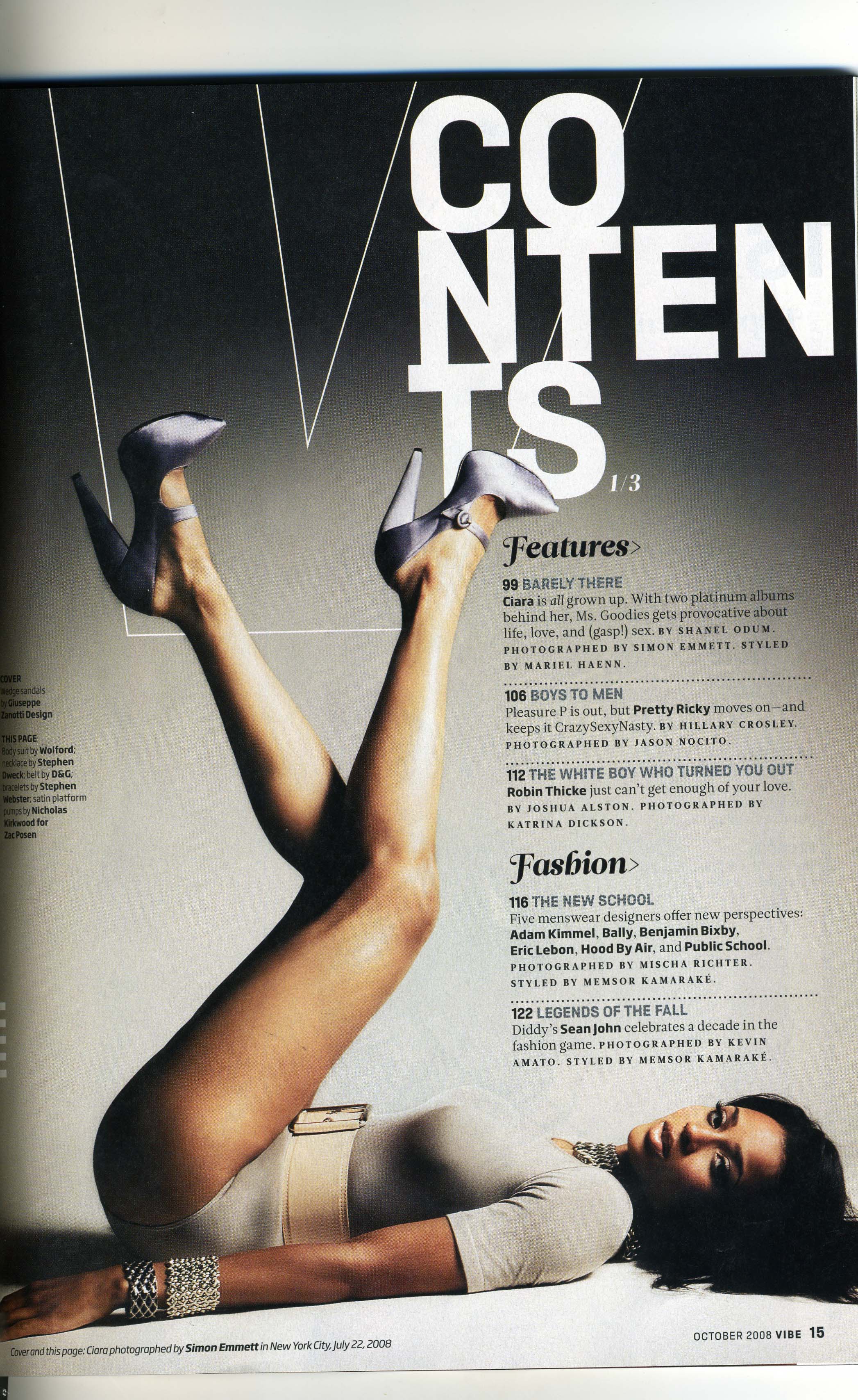
The word 'contents' is separated out which makes the magazine and contents page stand out more because it makes the magazine unique. It is white on a black background which contrasts well and makes the contents page look very well thought. As the contents looks well thought it may make the reader feel more interested in the magazine as important features are presented differently than other magazines.
The artist on the magazine is very eye catching and it is one of the first things that you see on the magazine contents page. I think it is a good quality having the artist on the magazine looking at the reader as it makes the magazine very audience engaging as she is on eye level with the audience and it makes them feel included. The magazine have the artists legs leading up to the word 'contents' which is the main feature on the magazine. The outfit on the artist is very neutral and it matches the colour scheme of the magazine. The artist has a mysterious look which is inviting and will make the reader want to read why her facial expression is done this way. Also with the artist having very limited clothing the male readers may feel intrigued as the artist looks seductive and secretive.
I think background colour suits the mysterious look on the models face as the white black and greyish scheme seems very hidden and mysterious. I think the background colour scheme seems very sophisticated, but on the other hand other readers may feel the background colour is very boring and dis-inviting.
The information on the contents is very clear and it is intriguing. It is easy and not difficult to read which is a positive quality of the magazine. The subheadings on the contents page are in a larger and different font to make them stand out. The small information is in a more simple font. Between the information the stories are separating by lines, I think this being done makes it more understandable for the reader.
Friday, 3 October 2014
Research & Planning - Camera Shots


These are my camera shots that I have learnt in media. I need to know these to be able to make my music magazine and also so I can analyse different types of media. I have wrote the names and what the shots are next to my images.
Wide Shot - A wide shot is used to show the setting in the frame/scene.
Aerial Shot - A aerial shot is used to show the setting from a high angle.
Research & Planning - Masthead Designs

I like the first one because I like how I decided to space out the laters. I have used quite a simple font because I feel that the magazine would look more sophisticated with a simple title as it is aimed at middle class teenagers to young adults.
I like the font of the second masthead because I feel it suits the pop genre but, I feel that the font looks to squashed together. I quite like the black font because I think it was stand out on a light background.
I like the font on the third masthead because I think it is clear and the font will stand out on a background. I'm not really sure on the colour of the masthead as it will be hard to match up with other colours to suit the genre of my magazine.
I am very unsure of the last masthead as I feel it doesn't suit either of my genres (indie or pop). I like the colour of the masthead but I don't think that the masthead in general will match its full need.
Subscribe to:
Comments (Atom)