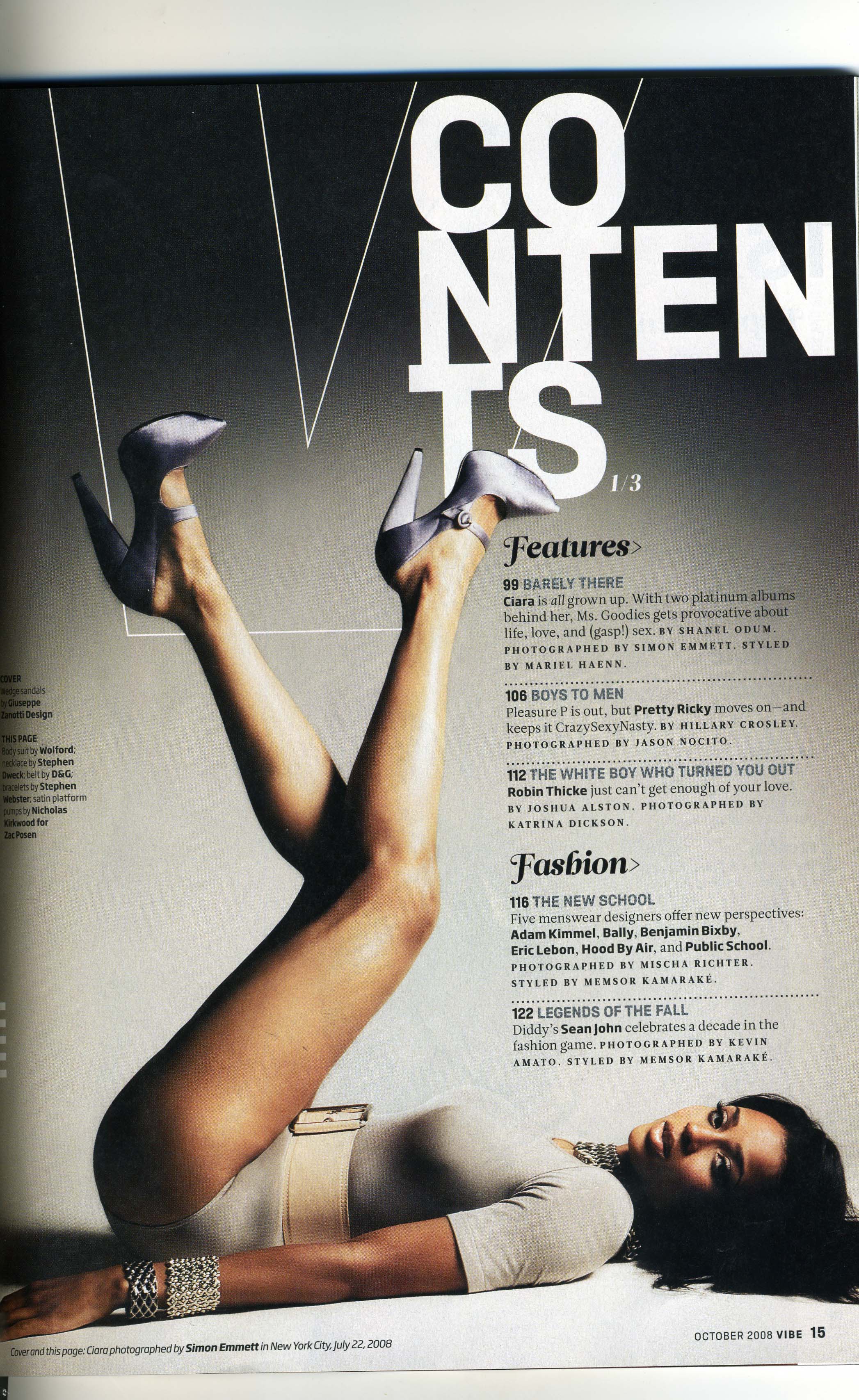
The word 'contents' is separated out which makes the magazine and contents page stand out more because it makes the magazine unique. It is white on a black background which contrasts well and makes the contents page look very well thought. As the contents looks well thought it may make the reader feel more interested in the magazine as important features are presented differently than other magazines.
The artist on the magazine is very eye catching and it is one of the first things that you see on the magazine contents page. I think it is a good quality having the artist on the magazine looking at the reader as it makes the magazine very audience engaging as she is on eye level with the audience and it makes them feel included. The magazine have the artists legs leading up to the word 'contents' which is the main feature on the magazine. The outfit on the artist is very neutral and it matches the colour scheme of the magazine. The artist has a mysterious look which is inviting and will make the reader want to read why her facial expression is done this way. Also with the artist having very limited clothing the male readers may feel intrigued as the artist looks seductive and secretive.
I think background colour suits the mysterious look on the models face as the white black and greyish scheme seems very hidden and mysterious. I think the background colour scheme seems very sophisticated, but on the other hand other readers may feel the background colour is very boring and dis-inviting.
The information on the contents is very clear and it is intriguing. It is easy and not difficult to read which is a positive quality of the magazine. The subheadings on the contents page are in a larger and different font to make them stand out. The small information is in a more simple font. Between the information the stories are separating by lines, I think this being done makes it more understandable for the reader.
No comments:
Post a Comment